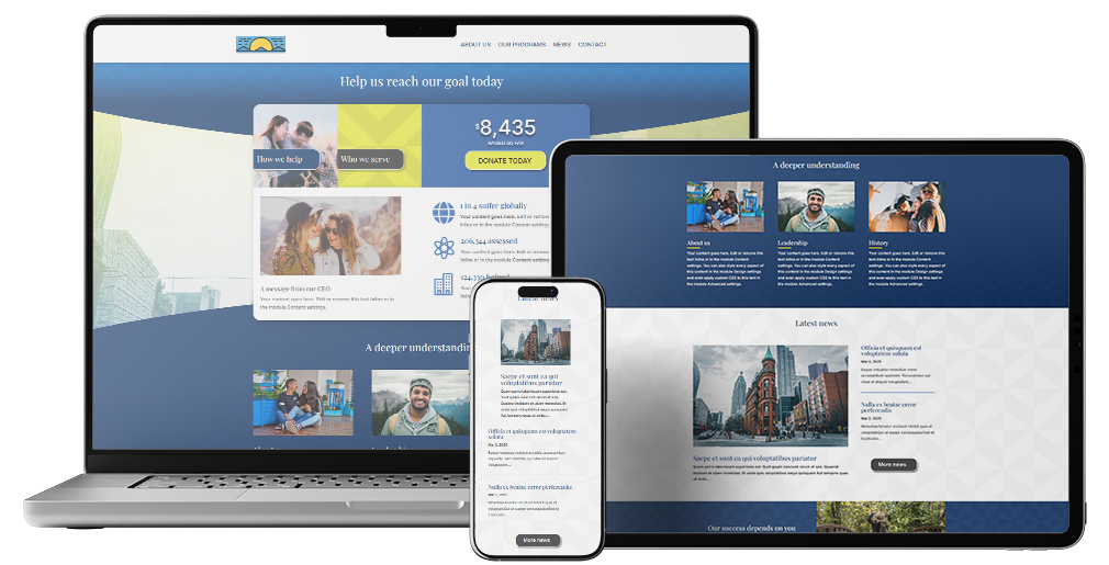
Field Aid Network
Concept, Design
Summary
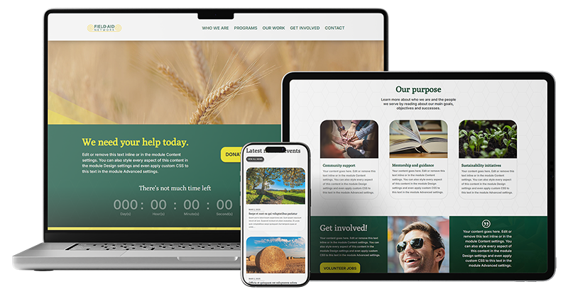
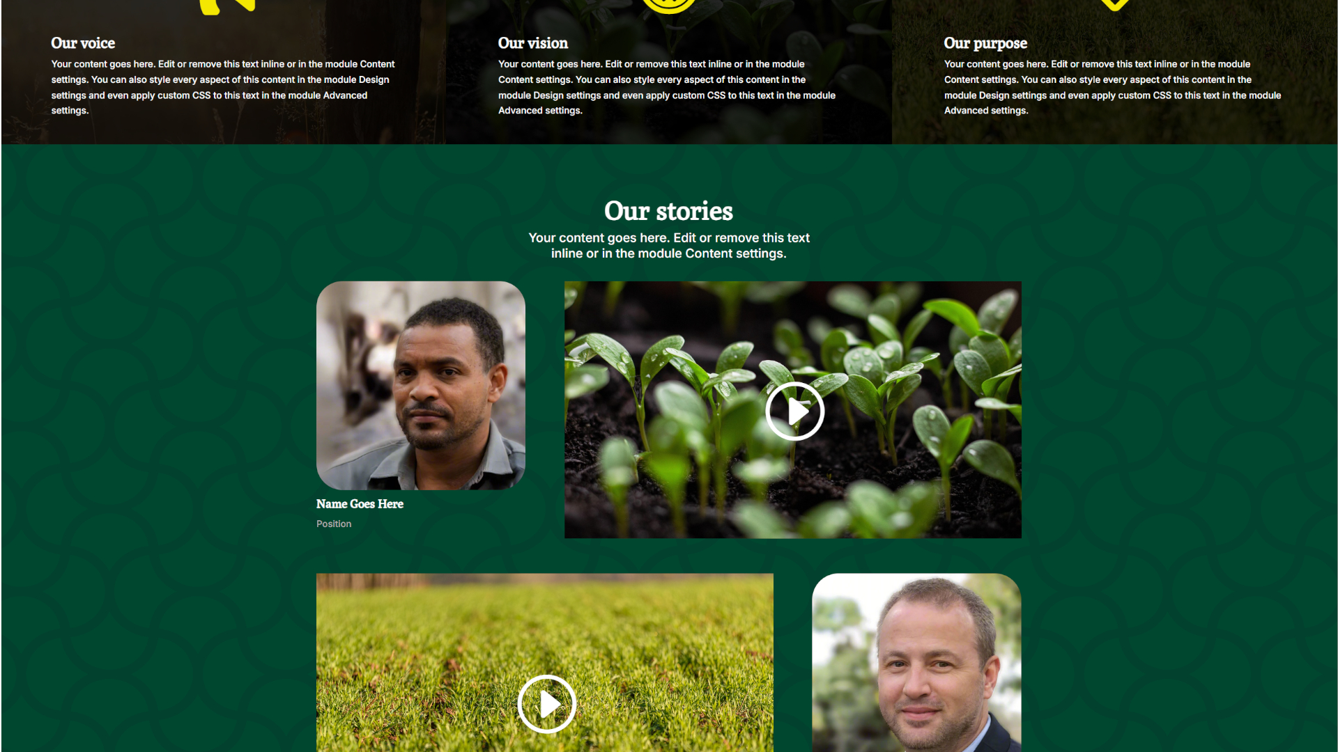
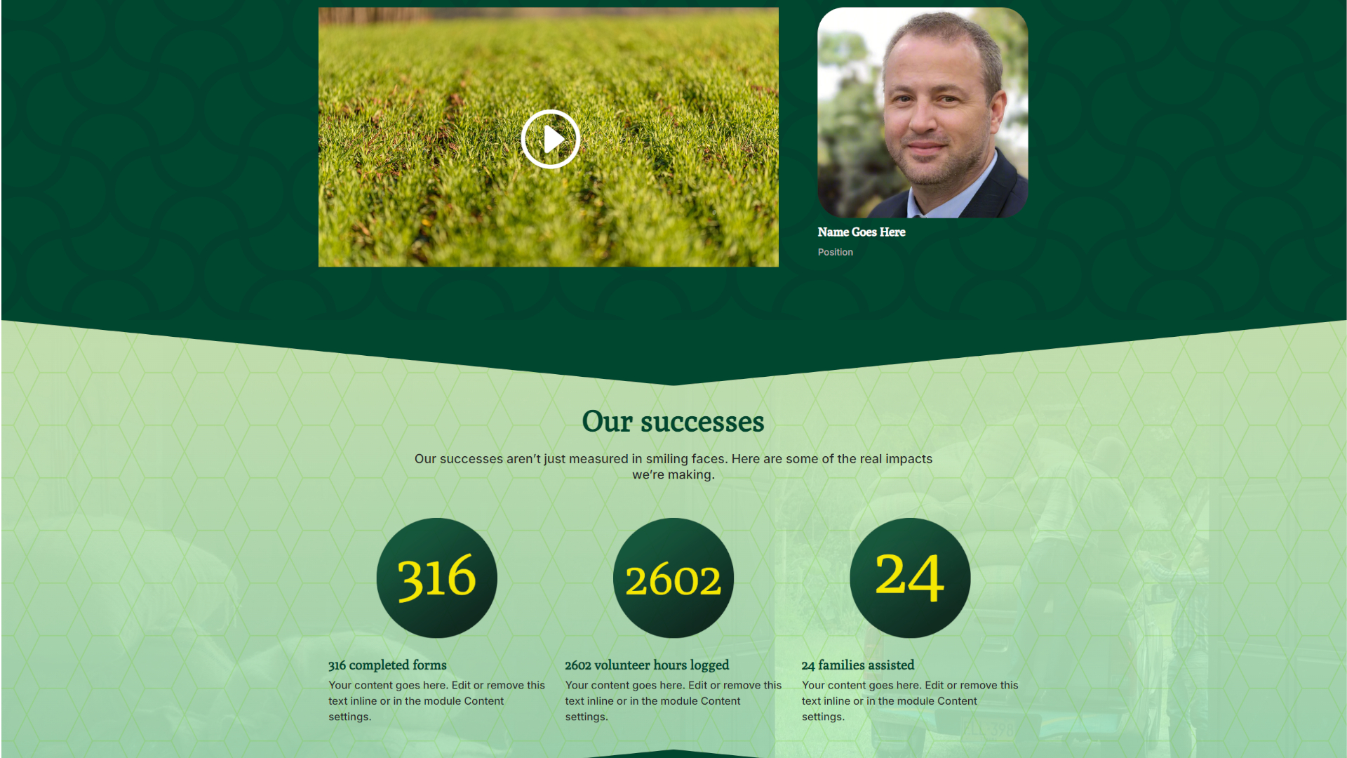
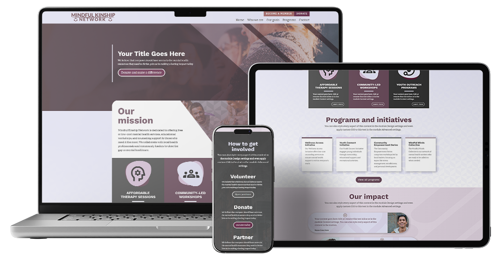
The design is structured to immediately grab attention and guide visitors through an intuitive narrative — from understanding the organization’s mission to getting involved or donating. It’s modern, mobile-friendly, and built with accessibility and clarity in mind.
Details
Categories
Concept, Design
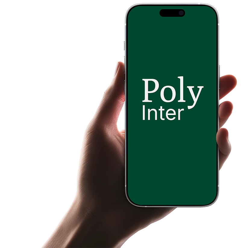
The Typography
Pairing Poly with Inter creates a refined and contemporary typographic combination. Poly, a serif typeface, brings a classic elegance to headings, while Inter, a sans-serif font designed for screen readability, ensures clarity in body text. This blend of traditional and modern styles offers a balanced visual hierarchy, making it suitable for this project.
The colours
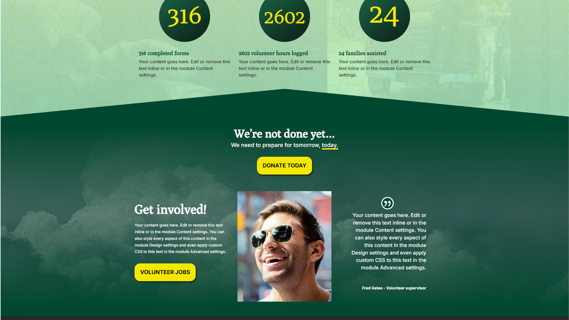
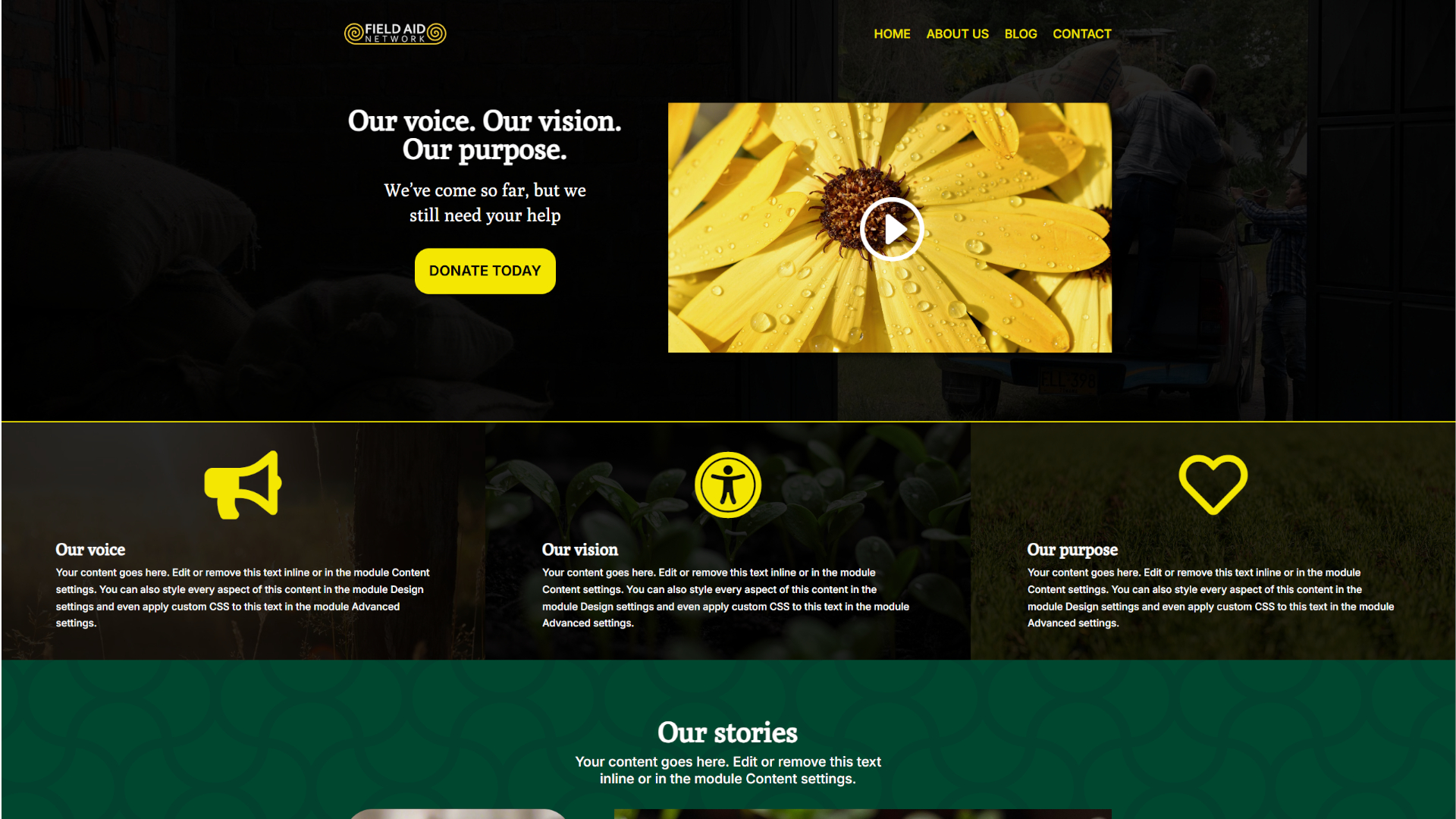
The colour palette is warm, earthy, and inviting — aligning well with the themes of agriculture, sustainability, and community. The Kaitoke green used throughout for headers, buttons, and background sections evokes trust, growth, and stability. The titanium yellow is featured in buttons, highlights, and overlays and creates energy and draws attention to calls-to-action like “Donate Today” and “Volunteer Jobs.”
Titanium yellow
#f4e800
Nero
#191919
Kaitoke green
#004730
Videos / Gallery


Projects
Design concepts and development projects
Contact
Whether you’re in the planning stages, ready to begin, or need some help getting your project across the finish line, I can help.