Burger Sausage Fries
Concept, Design
Summary
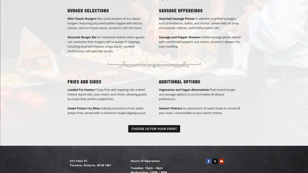
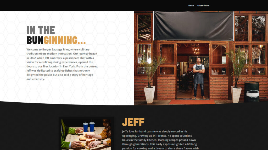
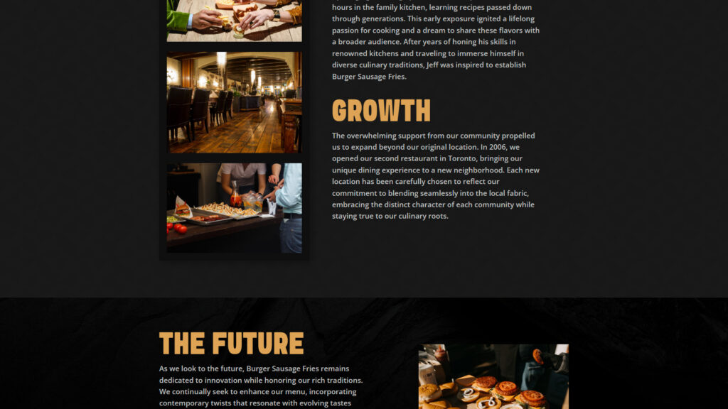
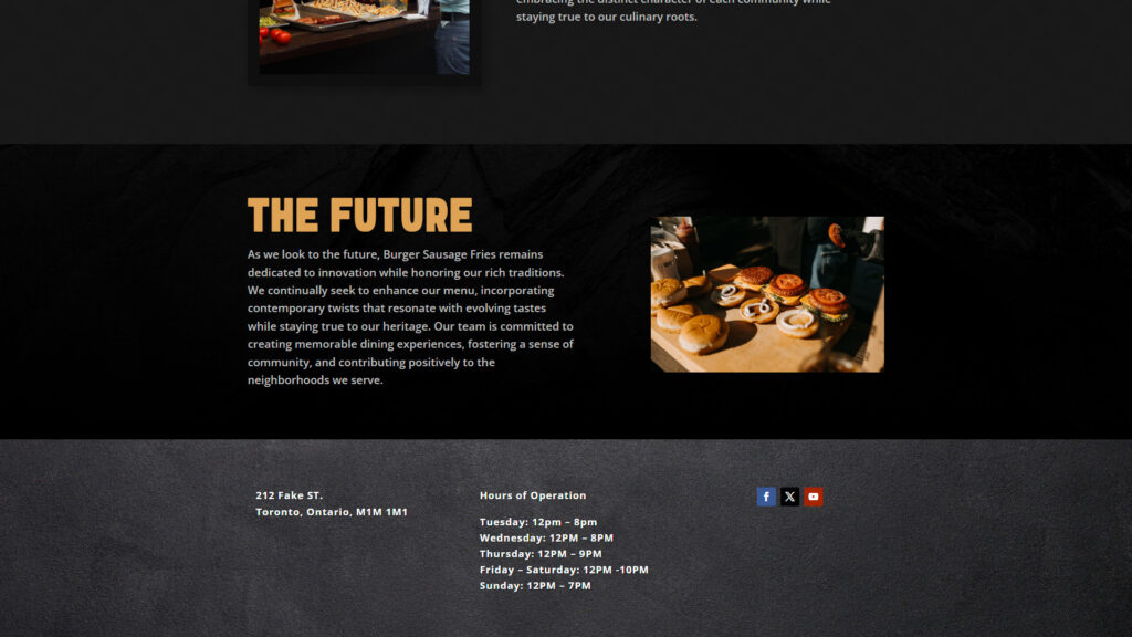
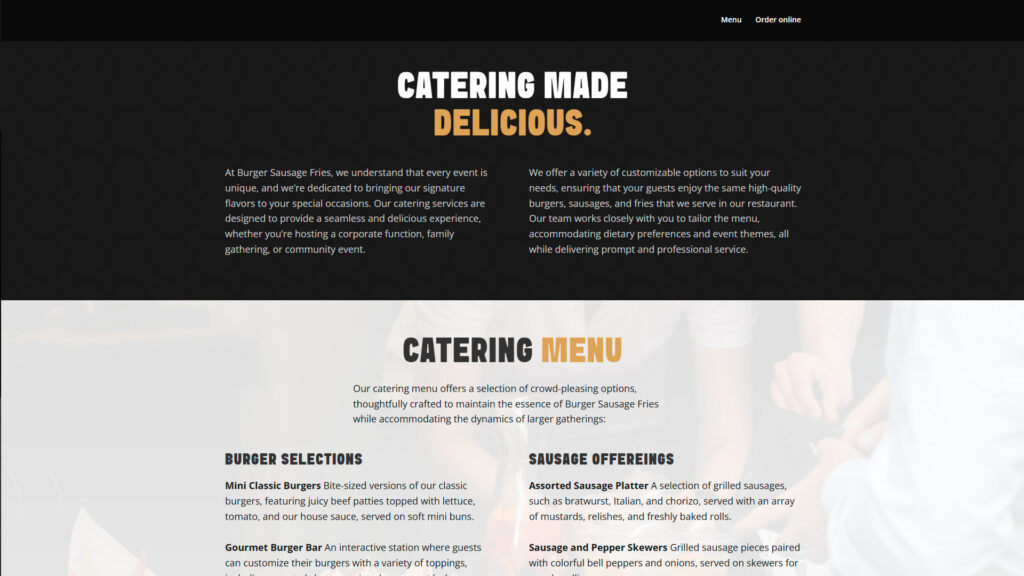
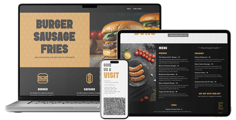
This website for Burger Sausage Fries presents a bold, confident design that leans into the appeal of indulgent comfort food. The layout is structured but visually engaging, balancing strong visuals with clear messaging.
Details
Categories
Concept, Design
The Typography
The Burger Sausage Fries design was created using Sink and Open Sans.
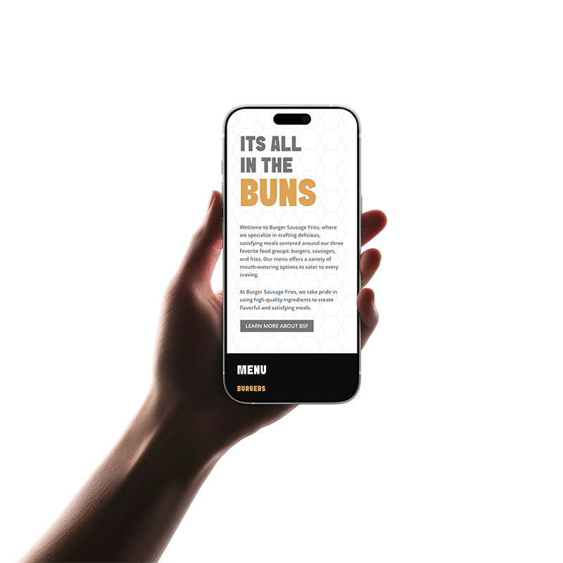
The use of large, stacked typography for headings gives the brand a playful but assertive voice. The chunky, all-uppercase slab-serif typeface used in titles creates a retro, diner-like feel, while the body text uses a simple, sans-serif font that keeps things clean and easy to read.
The colours
The color palette revolves around black, white, gray and a warm golden-orange that echoes the look of crispy fries or toasted buns. The dark background in key sections like the menu and catering area gives the content weight and contrast, while the orange is used to highlight headings, calls to action, and key phrases. A subtle honeycomb pattern appears in the background of some sections, adding texture without pulling focus from the content or food imagery.
Earth yellow
#dea355
Nero
#191919
Fresh silver
#757575
Projects
Design concepts and development projects
Contact
Whether you’re in the planning stages, ready to begin, or need some help getting your project across the finish line, I can help.


